I can honestly say that most of us don’t remember much of the OPEN ARCHIVE #1 opening on Saturday, but one thing’s for sure: we have a lotta love to give.


I can honestly say that most of us don’t remember much of the OPEN ARCHIVE #1 opening on Saturday, but one thing’s for sure: we have a lotta love to give.
We’re very happy to have Eliane Radigue at Argos. She’s coming over to attend the performance of Naldjorlak by Charles Curtis (@Argos) on Thursday 4 October, and the lecture by Manu Holterbach (@Q-O2) on Friday 5 October.
A pioneer composer of electro-acoustic music, Eliane Radigue is a remarkable figure in the contemporary experimental music scene. As soon as the early 50s, she was closely related to Pierre Schaeffer and Pierre Henry. From 1970, she started distinguishing herself from other composers by focusing on the new possibilities offered by the first synthesizers. More particularly, she worked with an ARP synthesizer, which became and remains her trademark. Her drone music, a continuous flow of intermingled sound waves, is impossible to ignore and is a major influence to a whole new generation of composers – in France as well as in many other countries.
“Eliane Radigue works with electronic sounds on tape to create an ambience within which sound seems to move in a continual flow around the listener. Her music has been described as “infinitely discreet … next to which all other music seems to be tugging at one’s sleeve for attention.”
–Michel Chion, in Les Musiques Electroacoustiques

THU 4 OCTOBER // 20:30 // ARGOS
concert Charles Curtis (cello): ‘Naldjorlak’, a composition by Eliane Radigue for Charles Curtis. in the presence of Eliane Radigue .
+ concert Mika Vainio / Lucio Capece
FRI 5 OCTOBER // 20:00 // Q-O2
lecture Manu Holterbach about Eliane Radigue + opening sound-installation ‘sigma’
Read a nice interview with Eliane on prism-escape
 In the context of the Video Vortex conference (5th of October) we asked some of our guests to compose a program of Internet video works, as a source of inspiration and reference. We’ll be posting the programmes on this blog.
Some of these programmes will be presented after the conference, during an informal screening
Jon Ippolito
Art After Institutions
LECTURE
ARGOS
17.05.07 // 20:30
Participatory media like Flickr and YouTube have given ordinary netizens a chance to shine as media creators, but this fact hasn’t gone over well with “serious” artists and their curatorial counterparts. Seemingly bereft of the social status, economic privilege, and institutional recognition of mainstream art stars, some new media artists wonder what role, if any, remains for them to play in the the Web 2.0 age of peer-filtered creativity. As Joline Blais and Jon Ippolito argue in the 2006 book At the Edge of Art, new media art’s dependence on institutions is indeed in crisis, but this is more of a loss for galleries and museums than for the artists themselves. For participatory media are on the verge of enabling creators to regain the power they once held before the era of commodity speculation and the art market: the ability to reconnect people in new forms of creative kinship, whereby artworks facilitate social transactions rather than financial ones. To accept this new role, however, artists, curators, and critics may have to renounce the pyramid scheme offered by the brick-and-mortar art world, replacing the monolithic canon of Great Artists with a dense network of creative participants.
The recipient of Tiffany, Lannan, and American Foundation awards, Jon Ippolito exhibited artwork with collaborative teammates Janet Cohen and Keith Frank at the Walker Art Center, ZKM/Center for Art and Media Karlsruhe, and WNET’s ReelNewYork Web site. As Associate Curator of Media Arts at the Guggenheim Museum, he curated Virtual Reality: An Emerging Medium and, with John G. Hanhardt, The Worlds of Nam June Paik. Ippolito’s critical writing has appeared in periodicals ranging from Flash Art and the Art Journal to the Washington Post. At the Still Water lab co-founded with Joline Blais, Ippolito is at work on three projects–the Variable Media Network, the Open Art Network, and their 2006 book At the Edge of Art–that aim to expand the art world beyond its traditional confines.
In cooperation with the International Visitors Program for Media Arts organised by Digitaal Platform IAK/IBK and Flanders Image.
You can browse through the presentation (built using ThoughtMesh software)
During his talk Jon also shared some notes from conversations he had with Geert Lovink, based on his text New Media Arts at the Crossroads, which Geert presented at Argos a few weeks ago.
Daniel Rosenberg
Line and Time
Argos, April 28, 2007
In the context of the exhibition ‘Anachronism’ (Argos, 27-03-2007 – 26-05-2007), curated by Elena Filipovic
What does history look like? How do you draw time? This talk sketches the shifting field of graphic representations of history from the beginning of the print age through the present. It explores the relationship between visual and conceptual structures in history and the remarkable panoply of mechanisms devised to mediate it. As a counterpoint to the various temporal schemas imagined by artists and made visible in the exhibition Anachronism, this talk focuses specifically on the history of the timeline, its birth, its rise, and its eventual critique. It examines connections between linear concepts and graphic lines, places where scholarship and artistic practice come into contact.
Daniel Rosenberg is Associate Professor of History at the University of Oregon. An intellectual and cultural historian, he has written extensively on the subject of time as well as the legacies of the Enlightenment in nineteenth and twentieth-century art, philosophy, and literature. He is editor of Histories of the Future (2005) with anthropologist Susan Harding and his current project on the history of the timeline is entitled The Graphic Invention of Modern Time.
See also ‘A Timeline of Timelines‘ in Cabinet Magazine
“My plan tonight is not to talk about art. Or, better put, my plan is to talk about non-art that has a relationship to art that I think is interesting, especially in light of this exhibition. Though I have only just seen the exhibition for the first time, one of the things about it that is striking to me is the number of ways in which it interrogates questions of history through the deployment of objects and situations that are not traditionally artistic: the snapshot, the found image, the everyday object, and so forth. What is more, there is a play throughout the show between the simulated and the real that raises questions about what is inside and what is outside of art.
As I have said, the images that I will be concerned with tonight are not art. Most were created by scholars or craftsmen, very few by artists, and in general they have been appreciated for their functional rather than their aesthetic qualities. There are some exceptions to this rule, most notably since the 1960s, and there are very interesting examples to be found in figures such as George Maciunas, Hans Haacke, and On Kawara, and very recently in the work of Jeremy Deller, Paul Chan, and others. This is in part a reflection of a general movement to infiltrate the realm of art with non-art. But, it seems to me that the time charts that have made it into “art” have a peculiar status.
These are works that explicitly problematize the historicity of art and the relationship between that historicity and the definitions of art itself. Perhaps the most influential of these charts were the several Fluxcharts of George Maciunas, works that took several different forms, that were at once an extension of the regular time charts that he learned to make in his world history classes, [Maciunas Russian history timeline] and an open provocation to the establishment of “modern art” parallel to that of the Fluxus happenings. In the timelines (here is one integrated into a happening) [happening photo], Maciunas played his cards very close to his chest. Were these supposed to be works of art or works about art? Were the categories that Maciunas created (and in particular the exile of various artists associated with Fluxus from the movement) to be taken seriously? Were the charts descriptive or prescriptive? Can the history of art be the subject of art? Finally, if the Fluxcharts were art, what about Maciunas’s class notes? [folded time]
With those questions on the table, let me turn to my talk itself by saying something about my general interest in historical time charts, and where it initially comes from.
To be honest, I began my project on time charts as something of a joke, a serious joke, but a joke nonetheless. A few years ago, I was asked to give a talk at an interdisciplinary conference on “Objects of Study.” The notion was to put scholars from different disciplines together on panels and to have them talk about the paradigmatic objects of their discipline. Thus, there was a literary scholar talking about a novel, an art historian talking about a painting, and so forth. In my case, I found it difficult to decide what object I should use. My discipline is history. But what is the object of history? Historians look at all kinds of objects, and indeed, both of the ones previously mentioned, novels and paintings, are of regular importance in historical work. But to say that the paradigmatic object of history is every kind of object seemed not very telling. It then occurred to me that in a way, the object of history is historical time itself. But what object could I bring to represent, not historical events or historical personages, but historical time.
And this is what I came up with. [Textbook timeline] This is the timeline from the back of the world history textbook that we used then in our introductory history course at the University of Oregon, where I teach. [Andre] Of course, bringing this artifact to the discussion was somewhat facetious: historians don’t normally study timelines themselves. But, as a thought experiment, it seemed worth pursing this object in a kind of “as if” scenario. What’s more, it was interesting to me that this object so central to the process of learning history had for so long gone unnoticed.
Now as for this particular timeline, I picked it not because I thought it was remarkable in some way but because it seem utterly unremarkable, purely unremarkable, a virtual symphony of unremarkableness. Not only is it generic, it aims to be generic. Its goal insofar as possible is to disappear into the background, to give prominence to events that might be inscribed upon it, to organize them, and to allow them their own meaning without imposing a meaning upon them. It is intended as a teaching tool and a heuristic, not as a kind of evidence in itself. And it actually succeeds in these things in part.
I suspect that a graphic of this kind is familiar to all of you. I don’t know precisely how history is taught in Belgium, but I would be shocked if you had not at one time or another seen something that looks very much like this. The very fact that you have probably encountered dozens of these in textbooks, newspapers, and TV reports, without ever thinking too hard about them suggests that they are to a great extent successful in what they do. [Pop culture timelines *]
But the fact that they are successful, does not mean that they are simple. And as I looked harder at this particular timeline, it occurred to me how many curious presuppositions were built into it.
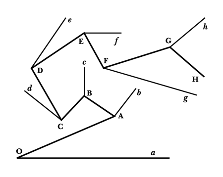
First of all, there is the periodization of the chart as a whole. I’m sure it’s not hard for you to figure out what this periodization is, but it is notable nonetheless. The chart runs from 3000BC to 2000AD. We can easily surmise from this that the chart comes from a world history textbook, that the textbook equates history with what is usually called “civilization” and civilization, almost certainly, with writing. And because there is only one line here, we can also surmise that the textbook strives in some way to link the many stories that might be told about the world into something like a single story.
We can also note that the internal periodization is decimal, that history, for this writer, does not move principally in thematic periods, but plays itself out inexorably though the space of what Walter Benjamin called, “empty homogeneous time.” [Perhaps this timeline is Argo that I was dreaming of.]
There are other details too that are worth noting. For example, the central point in the chart is not a year zero, but the year 1 AD, which is immediately preceded by the year 1 BC. This reminds us of the arbitrary and circumstantial character of the naming and counting conventions that we bring to history.
What is more, however unmarked this history appears, it is a history that, at least in the background, revolves around the memory of the purported birth of a Christian messiah. I say purported not because I intend to editorialize on the divinity of Jesus, but because already in the sixteenth century, it was very well known that Jesus could not have been born in the year 1, and was likely to have been born around the year 4 before the birth of Christ. [Show Lloyd Bible] (If you want anachronism, here’s anachronism for you.)
Finally, and then I promise that I will stop belaboring the point, there is the way in which the line is terminated at the top and bottom. Whether intended or not, this chart functions to bracket the question of millennial time. The way that the chart terminates suggests that natural time neither begins nor ends, that it simply flows uniformly creating a background for human events and achievements. At the same time, it takes no firm stand on the origin or the end of natural time, a position which, in America at least (a place where the propriety of teaching evolution in schools is still seriously debated) turns out to be a very stable compromise.
So, at any rate, this was something like the talk that I gave at that conference, and with that, I thought that my work on timelines was done. But as it turned out, I was only beginning. From this point, I began to actively collect interesting timelines. In the beginning, my curiosity about them was mostly formal. I thought that it would be valuable to look at a number of timelines together in the kind of optic that I have just suggested, and I was especially interested in those that continued off into the future since, at that time, I was working on a book on that subject. [If any of you would like to know more about that book, Histories of the Future, just let me know. We also did an issue of Cabinet magazine on the subject, that’s where the Timeline of Timelines comes from.]
[Ferguson image]
In this image, for example, you see the top section of Adam Ferguson’s wonderful chart of history from the 1797 edition of the Encyclopaedia Britannica, a chart which resembles the one that we’ve been looking at, but which also differs from it in ways that are worth noting. Along the top of Ferguson’s chart, you can see a series of geographic divisions of the world. As you can see, the chart makes an effort at synchronizing all of world history without precisely unifying it. As you cast your eye down the chart, down the path of historical time, you can see the waxing and waning of political powers, the union of states and so forth. [Ferguson’s flood] You also see Ferguson’s nod to Biblical History in his inscription on the years of the Flood.
In this next image, [Ferguson bottom] you see the bottom of the same chart. What intrigued me here was what Ferguson would do when he came to the end. There were a number of choices available to him. He might have stopped at precisely the moment when his research ended, or at the year of publication. He might also have ended the chart at the year 1800, which would have been a numerically neat place to cut things off. For reasons that I have not yet settled, Ferguson chose the date of 1900 to end the chart. Of course, there were no events or rulers to fill in for those additional 103 years after 1797. This does not mean that there is no content to those years. Ferguson continues the chart itself as if natural time, rather than, say, a narrative of supernatural beginnings and endings, were its principal structuring framework. Whatever Ferguson’s precise idea about what he was doing, the choice reflects a transition to a way of thinking about time characteristic of the modern world.
Ferguson’s was not the only graphical representation of time that I found that pushed off into the future. In fact, this gesture turned out to be very common in the genre. [Image 4: Radioactivity Diagram] In some cases, the function of these graphics was explicitly predictive, as in the case of this U. S. Department of Energy diagram from the 1990s indicating, in the most universally legible terms that it could devise, a prediction about the future stabilization of radioactive materials. The point of the icons is to communicate across great stretches of time, tens of thousands of years, periods over which radioactive isotopes are certain to survive while human languages may not. [Image 5: Renouvier] In other cases, such as this fascinating chart from Charles Renouvier’s Uchronia of 1876, the problem of linear representations of history is explicitly thematized. Renouvier’s chart branches to accommodate different possible choices and eventualities that may take place in the future. All of these artifacts were interesting, but the ones that captivated me most were those that stayed as close as possible to historical scale, the ones that might properly be referred to as timelines.
It occurred to me, as I began to gather a critical mass of these artifacts, that there was more to be done than just a typology. There was actually a very interesting history here as well. I had expected to find that the timeline would have been around for a very long time. In fact, it turned out to be of recent vintage, and not much older than the Ferguson chart that I have just shown you.
I admit that to assert that the timeline is modern may sound arbitrary, implausible, or both. If we widen our view to include all graphical representations of chronology, we can undoubtedly push our story much farther back in history. Indeed, it is conventional historiographical wisdom that the emergence of brute chronology precedes that of sophisticated historical narrative and that it forms one of its conditions of possibility. What is more, as Hayden White has argued, it has been difficult to get historians to think of chronology as anything more than an imperfect form of history. The traditional history of history traces a path from the enumerated (but not yet narrated) medieval date lists called “annals” through the narrated (but not yet narrative) accounts called “chronicles” to fully narrative forms of historiography that emerge finally with modernity itself. According to the traditional wisdom, for something to qualify as historiography proper, it is not enough that it “deal in real, rather than merely imaginary, events; and it is not enough that [it represent] events in its order of discourse according to the chronological framework in which they originally occurred. The events must be . . . narrated as well, that is to say, revealed as possessing a structure, an order of meaning, that they do not possess as mere sequence.”
It would seem nonetheless that by the Middle Ages, we find in place not only the necessary techniques of representation but also the temporal framework prerequisite to the timeline. From a certain perspective, the medieval annalists came quite close to creating timelines in the sense that I intend. As White notes, in the Annals of St. Gall and other similar medieval works, the manuscript page is organized in simple and separate fields containing dates and events. The dates proceed down the left hand column of the page, year by year, in a regular fashion. Events, on the other hand, appear irregularly, at least to a modern eye. Some lines indicate one event or several; others are completely barren; events of very different kinds are registered in precisely the same way. Thus we get sections that read like this:
712. Flood everywhere.
713.
714. Pippin, mayor of the palace died.
715. 716. 717.
718. Charles devastated the Saxons with great destruction.
719.
The form is tantalizingly close to a timeline, and I’m sure that there is an argument to be made that it already is one. But I think that we end up twisting our history out of shape if we push too hard in this direction. The concern of the annalist, as White suggests, was neither to indicate nor to measure historical process; rather, it was to submit the events of history in all of their heterogeneity to the unity of eschatological time. And this is a point that I will come back to later.
According to White, the old historiographical doxa which holds that the medieval annals are nothing more than “imperfect” histories misses the point of them entirely. To the annalist, the dates coursing down the left hand column of the page were all-important, more important even than the events on the right. The medieval annals, in other words, are not looking at an incomplete form of anything. To the contrary, they err toward what is for us a nearly unimaginable fullness. As White says, the time represented in this arrangement, “has no high points or low points; it is, we might say, paratactical and endless. It has no gaps. The list of times is full even if the list of events is not.” In a single stroke, White provides an explanation of why the Middle Ages produced so many artifacts that look so much like timelines, and why it nonetheless did not produce graphic timelines as such. In fact, more than one revolution in historical perception would still be necessary in order to produce the manner of seeing represented by the modern timeline. [Image 7: Priestley, Specimen of A Chart of Biography]
Here is an image from the most influential of the early timelines of the eighteenth century, indeed, one of the most influential timelines ever. Along with contemporary works by William Playfair and J. H. Lambert, it is very commonly cited as one of the great achievements in the history of statistical graphics. [The two diagrams below are from Lambert and Playfair.] The diagram above is called the Chart of Biography. It was created by the English scientist and theologian Joseph Priestley in 1765. Priestley was also the creator of a Chart of History published first in 1769 which is the basis of the Ferguson chart that we have just seen. [Priestley chart again] Both the Chart of Biography and the Chart of History were remarkably successful. I have not yet accounted for all of the editions in Britain and in the United States, but each went through at least ten, and they were both widely praised. Indeed, it is quite notable that in the statement of the Royal Society marking Priestley’s induction, it is his Chart of Biography rather than any of his scientific achievements that is mentioned. (Priestley, who would later discover oxygen, was no slouch in this regard.)
The Chart of Biography plots against a constant scale the lives of famous men over the course of approximately 3000 years beginning in 1200 B.C. Along the top and the bottom of the chart read dates at intervals of 100 with small dots indicating ten year intervals. From top to bottom, the century marks are connected by grid lines. The chart is also divided by horizontal lines that separate areas from top to bottom by theme. The top section of the chart is devoted to Historians, Antiquaries, and Lawyers. Below them are the Orators and Critics. Then come the Artists and Poets; the Mathematicians and Physicians; the Divines and Metaphysicians; and finally at the very bottom, the Statesmen and Warriors. The chart itself is filled to varying densities with solid black lines that either begin and end cleanly at the dates of birth and death or in a sequence of dots that marks uncertainty about a precise date. Above each line is a name.
The Chart is really a remarkable graphic object. Viewed at a distance, to use Priestley’s analogy, it looks like “so many small straws swimming on the surface of [an] immense river.” The chart is densest at the farthest right margin, that is to say, in the most recent historical period. This is no accident of historical record. According to Priestley, “the noblest prospect . . . is suggested by a view of the crowds of names in the divisions appropriated to the arts and sciences in the last two centuries. Here all the classes of renown, and, I may add, of merit, are full . . . . This prospect gives us a kind of security for the continual propagation and extension of knowledge; and that for the future, no more great chasms of men really eminent for knowledge, will ever disfigure that part of the chart of their lives which I cannot draw, or ever see drawn.” In other words, in Priestley’s view, the crowd of straws piled up at the right of the chart represents an actual historical phenomenon, the “acceleration” of the arts and science in his own time. In a chart such as this, Priestley writes, “what a figure must science make.” And, indeed, on his chart, something called science literally takes on a figure, perhaps for the first time.
Scanning backward from the present, each of the categories on the chart, with the exception of two, sees a noticeable decrease in density. The frequency with which the great thinkers and makers appear diminishes. Tracking backward, there is a striking drop at 1400, and a precipitous one at 1100. As Priestley notes, it is only the Statesmen and Warriors and (to a lesser extent) the Divines and Metaphysicians who appear consistently throughout time. Priestley writes, “By the several void spaces between . . . groups of great men, we have a clear idea of the great revolutions of all kinds of science, from the very origin of it; so that the thin and void places in the chart are, in fact, no less instructive than the most crowded . . . . We see no void spaces in the division of Statesmen, Heroes, and Politicians. The world hath never wanted competitors for empire and power, and least of all in those periods in which the sciences and the arts have been the most neglected.”
Priestley sees his own chart in aggregate. It is not that he has no interest in the individual stories that it represents. He notes, for example, “It is a peculiar kind of pleasure we receive, from such a view as this chart exhibits, of a great man, such as Sir Isaac Newton, seated, as it were, in the circle of his friends and illustrious contemporaries. We see at once with whom he was capable of holding conversation, and in a manner (from the distinct view of their respective ages) upon what terms they might converse.” But even in a passage such as this where Priestley concerns himself with an individual figure, the innovation of the chart is contextual: it allows us to see an individual such as Newton as a participant in a historical process. We should note also the curiously distanced way in which Priestley addresses the markers of life and death on the chart. Life and death, in the terms of the chart, are nothing more than markers of relative position.
This peculiar dynamic (and it is Priestley himself who calls it peculiar) is nowhere better indicated than in a passage in which Priestley promotes the specifically graphic effect of the chart. “They are the lines . . . which suggest the ideas; and this they do immediately, without the intervention of words: and what words would do but very imperfectly, and in a long time, this method effects in the completest manner possible, and almost at a single glance. . . .” Though Priestley says that names must be written on the chart, he specifies that their function on it is merely indexical. The chart functions fully as a graphical representation of history without a single name being mentioned. In Priestley’s words, “it is the black line under each name which is to be attended to: the names are only added because there was no other method of signifying what lives the lines stand for.”
I want to be clear: I am not claiming that Joseph Priestley was the very first person to create a timeline, nor that he should be viewed as a lone genius. (It would be very ironic to see him this way given the force of Priestley’s own analysis of scientific invention and conversation.) And Priestley himself never claims such a thing. In fact, he goes to great lengths to show how plain and traditional his idea actually was. At the same time, his account of what we might call the chronographic tradition makes quite clear where the salient differences lie. [Tallents chart] Among predecessors, Priestley points especially to three seventeenth-century scholars, Benjamin Marshall, Francis Tallents, and Christopher Helvicus, all of whom penned what Priestley called chronological tables. Such tables, Priestley says, are of tremendous use in the teaching and interpretation of history. In fact, he says, even if such charts “consist of nothing more than an enumeration of the capital events in history, thrown together promiscuously, without any distinction of kingdoms, regard being only had to the order of time in which the events happened, they have their use.” Priestley’s praise is tempered. In the cases of both Marshall and Tallents, he notes that the intervals of time between events in history can only be judged by the dates annexed to the table. The graphical presentation generally reflects the order of events but not the flow of time itself. This defect is attended to by Helvicus who Priestley says disposes “the events in such a manner, as that the distance at which they are placed, without attending to the date in the margin, shall give a just idea of the real interval of time between them.” [Tallents chart 2, Helvicus] But Priestley criticizes Helvicus too, for paying such lavish attention to the intricacies of comparative periodization that he nearly forgets the other possible uses of the table.
In fact, together Marshall, Tallents, and Helvicus make quite a good representative selection of early modern chronography. We could add lots of other names, and some who are probably more important in the big chronological picture. Certainly, we would want to mention Joseph Scaliger, James Ussher, and Isaac Newton. But Priestley is actually quite perceptive in this regard. The major figures in chronology were not necessarily the most important figures in chronography. Priestley himself points out that, Newton’s chronologies were not graphic. [Newton] This is especially striking given that Newton was the most important theorist of both optics and of physical time during his period, and given that both his optical treatise and his physics treatise were very well illustrated. Scaliger, for his part, made many charts, but like Helvicus, his principal concern was to align varying historical chronologies, not to illustrate the flow of history as such.
As for Ussher, he has perhaps a more important role in the specifically chronographic dimension of this story. Though he himself did little to change the way in which events were inscribed in historical tables, his influence led directly to the mainstreaming of the chronological project during the seventeenth century. [Lloyd bible] Ussher’s famous calculation that the world was created at precisely 6 pm on Saturday October 22, 4004 B.C. became dogma for the Anglican Church, and by 1701, it had actually made it into the margins of an officially sanctioned Bible. Looking at the dates that run down the sides of the pages of this book, it is easy to make an imaginative jump to the timeline. But we have to be careful: in fact, in this chronographic format, we are actually farther away from the timeline than we were in the Annals of St. Gall. There, at least, regularity in temporal denomination was the pattern if not the rule. Here, quite the opposite is the case. Dates flow only along with the narrative.
In this sense, Ussher’s approach is continuous with those just mentioned. You can see this very nicely in the chart of Tallents. [Tallents] As I have already noted, according to Priestley, Tallents had created a tool that could be very useful in the teaching of history. But his chart remained so deeply invested in the stories that it wants to tell that it breaks out into story in just about every dimension possible. And, while in certain places, the chronometric inconsistencies come across mostly as oversights, in other cases, they are clearly central to the project of the chart as, for example, in the places where Tallents switches representational registers altogether and moves from the mode of chronology to that of genealogy. [Priestley chart]
The innovation of Priestley was not to improve upon the representational mechanism of Tallents or Marshall but to shift the basic concerns of chronography away from the representation of particular events and toward the representation of events in general. Ironically, in some ways, this shift led Priestley back in the direction of the Annals of St. Gall. And here, the closeness of the form of the annals to that of the timeline begins to come into better focus. As Hayden White has argued, for the annalist, events are endowed with meaning “by being identified as parts of an integrated whole.” Or, he says, “To put it another way, the list of dates can be seen as the signified of which the events . . . are the signifiers.” While this is not quite true for Priestley, something parallel is. As in the medieval case, we can think of the lives and deaths of the historical figures on Priestley’s chart as signifiers of something else. But, in contrast to the medieval chronology, here what is signified is not the unity of history but its uniformity. In the Chart of Biography, Priestley both depicts and constitutes this uniformity. And in so doing he brings into possible view something like modern history itself.
It remains to say a few last words about anachronism and about how this strange artifact, the timeline, sheds light upon it. At a glance, it would seem that these two inventions of the eighteenth century are quite in tension with one another: the character of anachronism is precisely discontinuous, while the timeline seems the opposite.
There are two crucial things to say about this. The first, of course, is that the figure of historical discontinuity, that is to say, of the pastness of the past, requires the background of temporal continuity in order to appear at all. And in this respect, the form of the timeline is certainly inseparable from that of anachronism. But, I think that there is more here.
[Renouvier/Ferguson] The timeline itself produces an important and specific form of discontinuity, though it may not be immediately apparent. At the same time that it smoothes the contours of past and future into a uniform representation, it creates a new problem in the representation of the present. I have already pointed to the very strange mechanics that this produced at the end of Ferguson’s timeline. And this is a very usual problem. Renouvier’s branching timeline shows us another attempt to deal with the problem of actually representing presents in this form. And, even today, we haven’t really gotten much farther than Renouvier did more than a hundred years ago: the difficulty of representing the present time in the format of a timeline has still not been overcome.
[Barr: Cubism and Abstract Art cover]
By way of conclusion (though who could conclude on a subject such as this) I would just like to point to one more set of timelines that thematizes the problem of the present in order to suggest how lively this problem remains. There are any number of examples that I might have chosen for this purpose, but these strike me as particularly appropriate to our setting today, and they, finally, give a context for the intervention of George Maciunas. Let me begin with the best known of these images. This chart is from the cover of Alfred Barr’s 1936 catalog for the show Cubism and Abstract Art at the Museum of Modern Art in New York. This show was important for a number of reasons, not least of all, because of its rigorous insistence on both the historicity and the genealogical continuity of Cubism and Abstract Art with the nineteenth-century tradition of impressionism. Indeed little needs to be said in face of these diagrams, they so well express the presuppositions of their creator. One of the things that you will notice, again, expressed with remarkable efficiency, is the dual nature of the modernist lineage in Barr’s view. Here we have two genealogical lines, interacting only partially. One is geometrical, the other biomorphic, the first running from Cézanne and Seurat through Cubism and constructivism; the other, from Gaugin through Fauvism to Matisse and the abstract expressionism of Kandinsky.
If you think that this might have been a throwaway, think again. Not only did Barr conceptualize the display of art at MoMA under the sign of the timeline, he also conceptualized the collecting strategy of the museum in such terms. In fact, even as he was organizing the Cubism show, he was working in this direction. As the internal documents of the MoMA demonstrate, Barr was fairly obsessed with representing the theoretical and practical problems posed by modernism through the device of the timeline. [Image 10: Barr Diagram] Between 1933 and 1940, Barr offered to the Board of Directors of the Museum a number of drawings depicting the past and the future of the museum. In these diagrams, the MOMA collections are depicted as torpedos parting the waters of the current collections of the Metropolitan Museum of Art and heading off toward the future. [Met as a firewall against anachronism]
But, forceful as Barr’s image is (and you may note that Barr actually drew a little propeller blade at the rear end of the torpedo wedge and placed Mexico there at the head), there is something deeply wrong here, and Barr already knows it. Any institution that labels itself modern is immediately faced with a historical problem. And the timeline just makes this all the more obvious. The moment that you locate the modern as point in time, the moment, that is, that you “punctualize the present,” you instantly transform it into history. In the terms of the timeline, there is only history. The present, once represented, ceases to be present at all.
To the extent to which Barr’s timeline attempts to represent the present of modernity, it immediately transforms modernity into a potential subject of anachronism, and I suspect that in this room, there are not a few of us who react almost reflexively to Barr’s diagrams by seeing them as a kind of existential joke. [The butt of that joke, I suppose is the Met.]
In this respect, the Barr timeline is exemplary. It suggests how deeply the timeline is implicated in our conceptions of the modern. It also points to an essential dimension of the problem that might otherwise remain hidden. Like Priestley’s timeline, Ferguson’s, and all of the others, Barr’s timeline suggests that the founding gestures of modernity already implied the problem of the anachronic which artists from Maciunas to those represented in this exhibition continue to interrogate.”